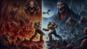
The roar of a rocket jump, the sizzle of a Railgun shot, the guttural cry of a freshly fragged foe – Quake Champions is a symphony of visceral, kinetic energy. It’s a game that grabs you by the throat and doesn’t let go, a relentless ballet of skill, speed, and brutal efficiency. But beneath the lightning-fast gameplay and pixel-perfect precision lies a rich visual tapestry, a world meticulously crafted long before the first line of code was written. This is the realm of concept art, the foundational DNA that shapes Quake Champions’ distinctive aesthetic, its unforgettable characters, and its hauntingly beautiful arenas. In this deep dive, we’ll peel back the layers of gore and glory to explore how concept art forged the visual soul of a modern arena shooter legend.
A Legacy Forged in Pixels and Polygons: The Quake Visual Heritage
To understand the concept art of Quake Champions, one must first appreciate the colossal shadow cast by its predecessors. The original Quake (1996) was a revolution, not just in its groundbreaking true 3D engine, but in its visual language. It plunged players into a nightmarish fusion of medieval gothic horror and Lovecraftian dread, its murky corridors and grotesque denizens setting a new standard for immersive, atmospheric game worlds. Concept artists of the era, though working with far more limited tools, laid the groundwork for this iconic style, sketching out the twisted architecture and monstrous forms that would become legendary.
Then came Quake II (1997), which pivoted dramatically towards a gritty, industrial science fiction aesthetic. The organic horrors of the first game gave way to the cold, cybernetic menace of the Strogg. Concept art here focused on biomechanical monstrosities, oppressive alien machinery, and the grim reality of a desperate war. The color palette shifted, the textures became more metallic and war-torn, establishing another distinct visual pillar of the Quake universe.
Quake III Arena (1999) distilled the franchise to its purest competitive essence. With no single-player campaign, the focus shifted squarely to multiplayer mayhem. This allowed concept artists to unleash their creativity on a diverse roster of combatants drawn from across the id Software multiverse and beyond. Arenas became fantastical, almost surreal battlegrounds, each with its own unique theme, from gothic cathedrals suspended in void to ancient temples and industrialized death traps. The visual language was about impact, readability, and creating memorable spaces for relentless duels. Names like Adrian Carmack and Kevin Cloud, and later Kenneth Scott, were instrumental in defining these early visual styles.
Quake Champions, arriving much later, faced the monumental task of honoring this diverse and often disparate visual heritage while forging its own identity. The concept art process was crucial in navigating this challenge: how to make a character like the classic Quakeguy (Ranger) feel at home alongside a cyborg like Visor, or an alien beast like Sorlag, all while battling in arenas that might evoke gothic horror one moment and alien desolation the next? The answer lay in a careful balancing act: reinterpreting classic designs with modern fidelity, establishing a cohesive (yet flexible) overall aesthetic, and ensuring that every visual element served the core Quake experience – fast, brutal, and skill-based.
The Pantheon of Pain: Deconstructing Champion Concept Art
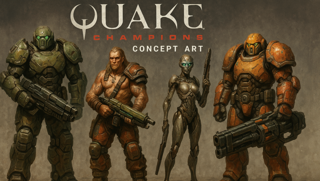
The Champions themselves are the heart and soul of the game, each a unique avatar of destruction. Concept artists play a pivotal role in bringing these warriors to life, moving from initial ideation sketches that explore silhouettes and core themes, to detailed renderings that define armor, weaponry, and personality.
A primary concern in designing Champions is silhouette and readability. In the heat of battle, players need to instantly recognize their opponents. Concept art explores distinct body shapes, iconic accessories, and movement styles that make each Champion stand out. Thematic resonance is also key; a Champion’s appearance must reflect their backstory, abilities, and overall “feel.” Finally, their special abilities often require specific visual cues, which are first explored and refined in the concept phase.
Let’s dissect the concept art of a few notable Champions:
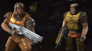
- Ranger: The original Quakeguy, Ranger is the stoic, battle-hardened marine. Concept art for him in Quake Champions focuses on updating his classic look – the familiar helmet, the rugged armor – with a higher level of detail and a sense of history. Artists explored variations in armor plating, wear-and-tear, and the design of his iconic Dire Orb. The challenge was to make him feel both nostalgic and new, a veteran of countless battles across dimensions. Early sketches might show different armor configurations, poses that convey his no-nonsense attitude, and explorations of how the Dire Orb materializes and teleports.
- Visor: The enigmatic cyborg from Quake III Arena returns, his cold, calculating nature a stark contrast to Ranger’s human grit. Concept art for Visor delves into his cybernetic enhancements. Artists meticulously designed his distinctive V-shaped optical sensor, the intricate wiring and mechanical components integrated into his form, and the sleek, efficient lines of his armor. The goal was to convey a sense of augmented perception and ruthless precision. Iterations would explore different levels of cybernetic integration, the texture of his synthetic skin, and how light interacts with his metallic parts, emphasizing his emotionless, predatory nature.
- Nyx: A fast, agile assassin, Nyx embodies stealth and spectral power. Her concept art emphasizes a lightweight, almost ethereal design. Artists explored sleek, form-fitting suits, often with flowing elements or energy trails that hint at her Ghostwalk ability. Color palettes tend towards cooler, darker tones, reinforcing her stealthy nature. Concept pieces would focus on dynamic poses, showcasing her agility, and visualizing the phase-shifting effect of her Ghostwalk, perhaps with translucent elements or energy distortions. The challenge is to make her look deadly yet elusive.
- Scalebearer: The hulking, horned warlord, Scalebearer is all about brute force and momentum. His concept art is a study in mass and aggression. Artists focused on conveying his immense size and strength through thick, heavy armor, prominent horns, and a powerful, imposing stance. Concepts for his Bull Rush ability would show him in motion, a blur of destructive energy, perhaps with impact effects and debris. Weapon concepts for him would also be oversized and brutal. The key was to make him look like an unstoppable juggernaut.
- Anarki: The rebellious, hoverboarding punk, Anarki brings a dose of anarchic energy. His concept art is vibrant and chaotic, focusing on his lanky frame, distinctive mohawk, and graffiti-adorned hoverboard. Artists explored various punk aesthetics, from tattered clothing to cybernetic enhancements that fuel his board. Dynamic poses are crucial, capturing his speed, aerial maneuvers, and defiant attitude. Color palettes are often brighter and more jarring than other Champions, reflecting his personality.
- Sorlag: This reptilian alien hunter is a fan favorite, known for her toxic spit and savage nature. Concept art for Sorlag is a masterclass in creature design. Artists explored various reptilian features, from scales and claws to her powerful tail and venomous glands. The goal was to create a creature that felt both alien and terrifyingly predatory. Concepts would detail her anatomy, skin textures, and the visual effects of her acid attacks, ensuring she looked formidable and uniquely non-human.
- Galena: The Unholy Paladin, Galena offers a fascinating blend of healer and warrior archetypes. Her concept art often plays with this duality. She might have elements of corrupted religious iconography in her armor, and her totems are a key visual element. Artists explored designs that felt both sacred and profane, with a focus on how her healing and damaging totems would appear, their energy signatures, and their overall impact on the battlefield.
- Death Knight: A classic villain from the original Quake, the Death Knight’s return was a nod to the franchise’s roots. Concept art focused on translating his medieval, demonic knight aesthetic into the Quake Champions style. This involved designing ornate, yet menacing armor, his signature flaming sword, and capturing his fiery, aggressive nature. Concepts would explore different armor sets, the intensity of his flames, and poses that exude ancient evil.
For each Champion, the journey from initial idea to final in-game model is iterative. Concept artists produce numerous sketches, color variations, and detailed turnarounds. These pieces not only define the look but also inform the 3D modelers and animators, ensuring the Champion’s essence is captured in every movement and action. Artists like Petur Arnorsson, known for his work on key art for Quake Champions, have helped solidify these characters in the public eye, often taking existing in-game models and posing/detailing them for promotional imagery that itself draws heavily on concept art principles.
Arenas of Annihilation: Crafting the Battlegrounds
The arenas of Quake Champions are more than just digital playgrounds; they are characters in their own right, each with a distinct personality, history, and set of challenges. Concept art is instrumental in establishing this identity long before level designers begin blocking out corridors and jump pads.
Core principles guide arena concept design: flow and layout are paramount for gameplay, but visual storytelling, thematic coherence, and atmosphere are what make an arena memorable. Concept artists work to create spaces that are not only fun to fight in but also visually stunning and evocative.
- Blood Covenant: A loving reimagining of the legendary Q3DM6 (“The Camping Grounds”), Blood Covenant is a masterclass in gothic arena design. Concept art for this map would explore its soaring arches, stained-glass windows (often depicting demonic figures), lava pits, and intricate stonework. Artists focused on capturing a sense of dark majesty and ancient evil. Lighting studies would be crucial, emphasizing dramatic shadows, the glow of lava, and eerie ambient light to create a foreboding atmosphere. Iterations might explore different architectural details, levels of decay, and the placement of iconic Quake symbols.
- Ruins of Sarnath: These jungle-choked, ancient ruins evoke a strong Lovecraftian vibe. Concept art for Sarnath would emphasize crumbling ziggurats, moss-covered statues of forgotten gods, and dark, watery passages. The artists’ goal here is to create a sense of mystery, ancient power, and oppressive humidity. Color palettes would lean towards earthy greens, grays, and dark blues, with lighting used to highlight eerie details and create a sense of claustrophobia in its tighter sections, contrasted with more open, temple-like areas.
- Lockbox: Shifting to a more industrial and claustrophobic theme, Lockbox is a maze of metal, pipes, and tight corridors. Concept art for this arena would focus on creating a sense of confinement and danger. Artists would explore different metallic textures, complex machinery, and the interplay of artificial lighting – flickering fluorescents, warning lights, and deep shadows. Environmental hazards, like crushing pistons or electrical discharges, would also be visualized in the concept phase.
- Corrupted Keep: This arena presents a twisted, almost surreal take on a medieval fortress. Concept art for Corrupted Keep would explore warped architecture, unnatural growths, and ethereal energy effects. The challenge is to blend familiar medieval elements with otherworldly corruption, creating a space that feels both recognizable and deeply unsettling. Artists might experiment with impossible geometry, strange organic intrusions on stone structures, and a color palette that suggests decay and magical taint.
- Burial Chamber: An Egyptian-themed map with a dark twist. Concept art would delve into grand halls adorned with hieroglyphs, imposing sarcophagi, and sandy, trap-filled corridors. The lighting would play a key role, from shafts of desert light piercing the gloom to the eerie glow of magical artifacts, creating an atmosphere of ancient mystery and deadly secrets.
Across all arenas, concept artists use a variety of techniques. Initial “mood pieces” might establish the overall atmosphere and color palette. More detailed architectural sketches define key structures and landmarks. Lighting and texture studies bring the environment to life, while callout sheets might specify details for props and environmental storytelling elements (like banners, runes, or signs of past battles). The art guides the level designers in creating spaces that are not only strategically interesting but also rich in visual narrative.
The Tools of Torment: Weapon Concept Design
In Quake, weapons are an extension of the player’s will, each a finely tuned instrument of destruction. The concept art for Quake Champions’ arsenal had to respect the legacy of these iconic tools while giving them a modern refresh.
Key considerations for weapon concept art include:
- Iconic Silhouettes: Players need to recognize weapons instantly, whether they’re lying on the ground or in an opponent’s hands. Concept artists work to ensure each weapon has a distinct and memorable shape.
- Visual Feedback: The design should hint at the weapon’s function and power. A Rocket Launcher should look explosive, a Railgun precise, a Lightning Gun crackling with energy.
- Animation Potential: How will the weapon look when firing, reloading, or being switched? Concept art often includes sketches of these states.
- Thematic Consistency: While diverse, weapons should generally fit within the Quake aesthetic – often a blend of rugged functionality and slightly sci-fi or even arcane elements.
Concept art for the Machinegun might explore different barrel configurations, ammo feeds, and stock designs, aiming for a look of reliable, sustained fire. The Shotgun (both standard and Super Shotgun) concepts would focus on a chunky, powerful appearance, emphasizing its close-range devastation. For the Nailgun (and Super Nailgun), artists would play with its somewhat crude, industrial feel, perhaps showing exposed mechanisms and heavy-duty construction.
The Rocket Launcher is a Quake staple, and its concept art would explore robust, almost oversized designs, often with multiple barrels or a distinctive muzzle that screams “explosive power.” The Lightning Gun concepts are all about visualizing raw electrical energy – coils, emitters, and crackling arcs of lightning. The Railgun, the sniper’s choice, would have concepts emphasizing its long barrel, advanced optics, and a sleek, high-tech look, hinting at its precision and devastating single-shot impact. Artists like those at MeckanicalMind have shared concepts for weapon skins, showcasing how even existing models can be thematically reimagined, such as a Lovecraftian-themed shotgun or a Pummel melee weapon skin based on the Quake III Arena Gauntlet.
These initial visual designs are crucial. They define not just how a weapon looks, but also contribute to its perceived “feel” – its weight, recoil, and impact – long before those mechanics are implemented.
From Sketch to Scream: The Concept Art Pipeline
The creation of concept art is an iterative process, a journey from rough ideas to polished visuals that guide the entire art team. It typically involves several stages:
- Thumbnails and Ideation: Artists begin with small, quick sketches (thumbnails) to explore a multitude of ideas for a character, arena, or weapon. The focus is on silhouette, composition, and core concepts rather than detail.
- Detailed Sketches and Linework: Promising thumbnails are developed into more detailed drawings, refining forms, adding specific features, and establishing a clearer vision.
- Color Studies and Mood Pieces: Artists explore different color palettes and lighting scenarios to define the mood and atmosphere. For arenas, these “mood pieces” are especially important in capturing the intended emotional impact of the environment.
- Material Indication and Texture Callouts: For characters and weapons, concepts will start to indicate materials (metal, leather, flesh, energy) and textures.
- Turnarounds and Orthographics: For 3D modelers, concept artists often create “turnaround” sheets, showing a character or object from multiple angles (front, side, back) to ensure accurate translation into 3D.
- Collaboration and Iteration: Throughout this process, there’s constant collaboration with art directors, game designers, and other artists. Feedback is incorporated, and designs are refined until they meet the project’s goals. Concept art may even inspire 3D blockouts of levels, which in turn might lead to further concept revisions.
This pipeline ensures that the artistic vision is clear, consistent, and effectively communicated to the rest of the development team.
The Unseen Architects: Artists and Studios
While id Software’s internal art team is the driving force behind Quake Champions’ visuals, the game also benefited from the talents of external artists and studios. For instance, studios like Meduzarts Digital Arts and artists such as Petur Arnorsson were involved in creating high-impact key art and promotional imagery, which often builds upon the established in-game concept art to create dramatic and polished scenes. The Quake Champions comics, with art by individuals like Alan Quah, also offer another avenue where the game’s visual themes and character backstories are explored, often drawing inspiration from or running parallel to the game’s core concept designs. Recognizing these contributions highlights the collaborative nature of modern game development, where many hands shape the final visual product.
Conclusion: The Enduring Vision
Concept art is far more than just pretty pictures; it is the lifeblood of a game’s visual identity. In Quake Champions, it’s the silent architect behind every menacing Champion, every breathtaking arena, and every satisfyingly chunky weapon. It’s a testament to the power of artistic vision to bridge the gap between legacy and innovation, honoring the dark, gritty, and fantastical roots of the Quake franchise while pushing its aesthetic into the modern era.
The artists who toiled over these designs, exploring countless iterations of form, color, and light, have crafted a world that is both brutally beautiful and instantly recognizable. Their work ensures that every moment in Quake Champions – from the tense anticipation before a duel to the explosive climax of a perfectly aimed rocket – is underpinned by a cohesive and compelling visual experience. The concept art of Quake Champions is not just a glimpse into its development; it’s an invitation into its very soul, a world forged in imagination and brought to life in glorious, blood-soaked detail.